


If you’re one who gets excited about design trends, Pantone recently announced “Ultimate Gray” and “Illuminating” as the 2021 Colors of the Year.
We’re pleased to announce that three recent creative projects have received awards from the 2024 International Hermes Creative Awards Competition.
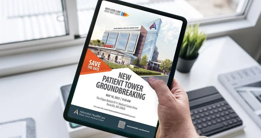
Shady Grove Medical Center has recently introduced the construction of a new tower building, with a focus on providing patient-centric care and innovation. The advertising campaign by CMBell showcases the hospital's cutting-edge technologies and medical advancements through captivating visuals and compelling narratives, representing the hospital's transformative journey.
How do you know if you’re getting the best possible results from your social media?
You should be getting leads (or sales, if your product can be purchased online), and your audience and engagement should be growing.
If you’re ready to level up your video content game, the next step is figuring out what kinds of videos will fit your goals.
Here are just a few of the video options to consider:
Looking to hire a new communication team leader?
Hiring for a communication position—and wishing you could dig a bit deeper than the standard interview questions? You know, the ones that ask about strengths and weakness, career plans, and why they are interested in this particular position.
If you’re one who gets excited about design trends, Pantone recently announced “Ultimate Gray” and “Illuminating” as the 2021 Colors of the Year.
Maybe there's a reason that blue is the #1 choice for corporate branding and identity, as many hope to cash in on the intrinsic belief that blue represents constancy, quality, and achievement. It does seem to be a color that many executives like—and as you can see, we’ve used it for our own brand because of its classic, timeless appeal.
While colors are trending towards bright, vivid hues, the hard-working neutrals—white, gray, black, and brown—have a staying power because of their flexibility. They might not be your favorite color, they don't tend to steal the show, they aren't usually even noticeable, but they are the bedrock of strong design.

Graphic standards are designed to create visual cohesiveness for your brand. But their usefulness can vary widely depending on how old they are, how robust they are and how they have responded to changes in your world.
Here are six questions to ask to see if your graphic standards are still serving you well—or need an update.
Is the logo practical?
Does it perform on a lapel pin and on the Web as well as it does on an outdoor board? In color or black and white? Professional designers test their recommendations in these venues before making them, yet we still find logos out there that are difficult to deploy in different applications.
Is the logo footprint unwieldy?
Square, round or odd-shaped logos often get problematic because their footprint doesn’t integrate well into an application. A discrete, contained footprint is often the most practical one for a logo.
Do you have enough font options?
Different applications require different types of fonts. Fonts that work well on an outdoor board aren’t always the same ones that work well on the Web. So be sure you have enough font options for all of your applications.
Is there a standard font included for the non-designer?
Hundreds or thousands of people in your company will be trying to work with these standards from the comfort of their own laptops and desktop computers, all armed with the standard fonts that come with their computers. You should have at least one of these standard fonts as an option in your recommended fonts—or it could end up being very costly to purchase specialty fonts for every user.
Do you find yourself struggling with the colors?
Maybe the palette doesn’t translate well to Web applications. Or you find there isn’t enough contrast in the colors to provide readable print or outdoor creative. Or there aren’t enough colors to serve your needs. Or perhaps the colors are starting to feel dated. Colors do go out of style, particularly those that aren’t classic colors, so if yours aren’t looking fresh, add some new ones.
Can your logo be built in four-color vs. adding Pantone spot colors?
A logo that requires Pantone spot color can add cost, because it requires adding another ink to a four-color process. Designing one that can be built using four-color process can save you printing costs.
If these are problems, you can update your standards—you don’t have to completely recreate them to keep them useful. Add colors, fonts and applications as you see the need. While it’s important to have consistency across a brand, brands migrate visually with time and this isn’t necessarily bad. Remember that while it’s important to preserve consistency, it is ultimately as important that your visual brand works for you. Tweaking it as your business needs change should be expected.
What problems are you having with your graphic standards that could be improved with a little tweaking?