


We’re pleased to announce that three recent creative projects have received awards from the 2024 International Hermes Creative Awards Competition.
We’re pleased to announce that three recent creative projects have received awards from the 2024 International Hermes Creative Awards Competition.
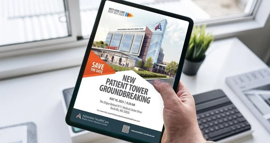
Shady Grove Medical Center has recently introduced the construction of a new tower building, with a focus on providing patient-centric care and innovation. The advertising campaign by CMBell showcases the hospital's cutting-edge technologies and medical advancements through captivating visuals and compelling narratives, representing the hospital's transformative journey.
How do you know if you’re getting the best possible results from your social media?
You should be getting leads (or sales, if your product can be purchased online), and your audience and engagement should be growing.
If you’re ready to level up your video content game, the next step is figuring out what kinds of videos will fit your goals.
Here are just a few of the video options to consider:
Looking to hire a new communication team leader?
Hiring for a communication position—and wishing you could dig a bit deeper than the standard interview questions? You know, the ones that ask about strengths and weakness, career plans, and why they are interested in this particular position.
We’re pleased to announce that creative projects produced with two of our clients have received awards from the 2023 International MarCom Awards Competition—one gold, and one honorable mention.
The MarCom Awards honor excellence in marketing and communication and represent one of the largest creative competitions in the world.
We’d like to thank our team, Red Reina, and Independent Colleges of Washington for being outstanding creative partners and inspiring award-winning work!
What goes in to making a campaign that gets noticed—and creates awareness?
Lots of decisions! Here are some of the reasons behind the campaign we created with the Walla Walla County Department of Community Health, as part of their work to prevent suicide, provide access to mental health resources, de-stigmatize mental health issues, create awareness about the dangers of fentanyl, and prevent opioid use.
We’re pleased to announce that projects produced for two of our clients have received awards from the 2022 International Hermes Creative Awards Competition. We’d like to thank our team, Inland Empire Health Plan and Walla Walla County Department of Community Health for being outstanding creative partners and inspiring award-winning work!
We’re pleased to announce that creative projects produced with three of our clients have received awards from the 2022 International MarCom Awards Competition. The MarCom Awards honor excellence in marketing and communication and represent one of the largest creative competitions in the world. We’d like to thank our team, Walla Walla Symphony, Inland Empire Health Plan, and Weston Mountain Lodge for being outstanding creative partners and inspiring award-winning work!
Communication has never been more important to businesses and organizations. A company’s website is probably the most important marketing and sales tool available. It’s important to update stagnant designs after five years or more.
CMBell recently redesigned the visual brand for Stella’s Homestead, and in this entry, we’ll take you behind the scenes on some of the work that led up to this.
If you’re one who gets excited about design trends, Pantone recently announced “Ultimate Gray” and “Illuminating” as the 2021 Colors of the Year.
CMBell and four of our clients have received awards from the 2020 International MarCom Awards Competition. The MarCom Awards honor excellence in marketing and communication and represent one of the largest creative competitions in the world—with 6,000 entries submitted from creative teams in dozens of countries.
Maybe there's a reason that blue is the #1 choice for corporate branding and identity, as many hope to cash in on the intrinsic belief that blue represents constancy, quality, and achievement. It does seem to be a color that many executives like—and as you can see, we’ve used it for our own brand because of its classic, timeless appeal.
The way we adapt to the crowded world of communication is by evaluating a message in a matter of seconds to see if it interests us. If it doesn't, we move on. Your job as a presenter, then, is to make it as rewarding and easy as possible for your viewer to grasp your message.
Here are 10 things you can do right now to improve your PowerPoint or other presentations:
Why are the “Job” and the “About Us” pages so frequently lackluster on business websites?
For most, it's probably a practical reason. Once that content is developed, there's generally little reason to revisit it. It falls into that perilous category of important but not urgent, and there it languishes—missing untold opportunities to persuade, compel, and sell.


![How Two of Your Company's Web Pages Could Be Hurting Your Business [and What You Can Do About It]](https://images.squarespace-cdn.com/content/v1/520ae1d7e4b0734e32e175ff/1550591859318-98TJUVXXESXZP6Y5ZMYM/airbnb.imac-3+2.jpg)