
Graphic standards are designed to create visual cohesiveness for your brand. But their usefulness can vary widely depending on how old they are, how robust they are and how they have responded to changes in your world.
Here are six questions to ask to see if your graphic standards are still serving you well—or need an update.
Is the logo practical?
Does it perform on a lapel pin and on the Web as well as it does on an outdoor board? In color or black and white? Professional designers test their recommendations in these venues before making them, yet we still find logos out there that are difficult to deploy in different applications.
Is the logo footprint unwieldy?
Square, round or odd-shaped logos often get problematic because their footprint doesn’t integrate well into an application. A discrete, contained footprint is often the most practical one for a logo.
Do you have enough font options?
Different applications require different types of fonts. Fonts that work well on an outdoor board aren’t always the same ones that work well on the Web. So be sure you have enough font options for all of your applications.
Is there a standard font included for the non-designer?
Hundreds or thousands of people in your company will be trying to work with these standards from the comfort of their own laptops and desktop computers, all armed with the standard fonts that come with their computers. You should have at least one of these standard fonts as an option in your recommended fonts—or it could end up being very costly to purchase specialty fonts for every user.
Do you find yourself struggling with the colors?
Maybe the palette doesn’t translate well to Web applications. Or you find there isn’t enough contrast in the colors to provide readable print or outdoor creative. Or there aren’t enough colors to serve your needs. Or perhaps the colors are starting to feel dated. Colors do go out of style, particularly those that aren’t classic colors, so if yours aren’t looking fresh, add some new ones.
Can your logo be built in four-color vs. adding Pantone spot colors?
A logo that requires Pantone spot color can add cost, because it requires adding another ink to a four-color process. Designing one that can be built using four-color process can save you printing costs.
If these are problems, you can update your standards—you don’t have to completely recreate them to keep them useful. Add colors, fonts and applications as you see the need. While it’s important to have consistency across a brand, brands migrate visually with time and this isn’t necessarily bad. Remember that while it’s important to preserve consistency, it is ultimately as important that your visual brand works for you. Tweaking it as your business needs change should be expected.
What problems are you having with your graphic standards that could be improved with a little tweaking?
Executive Communications
The senior leaders who get passed over aren't always less competent. Some have just never examined the signals they're sending with their presence—which is the sum total of what you say and do.

Design, Marketing
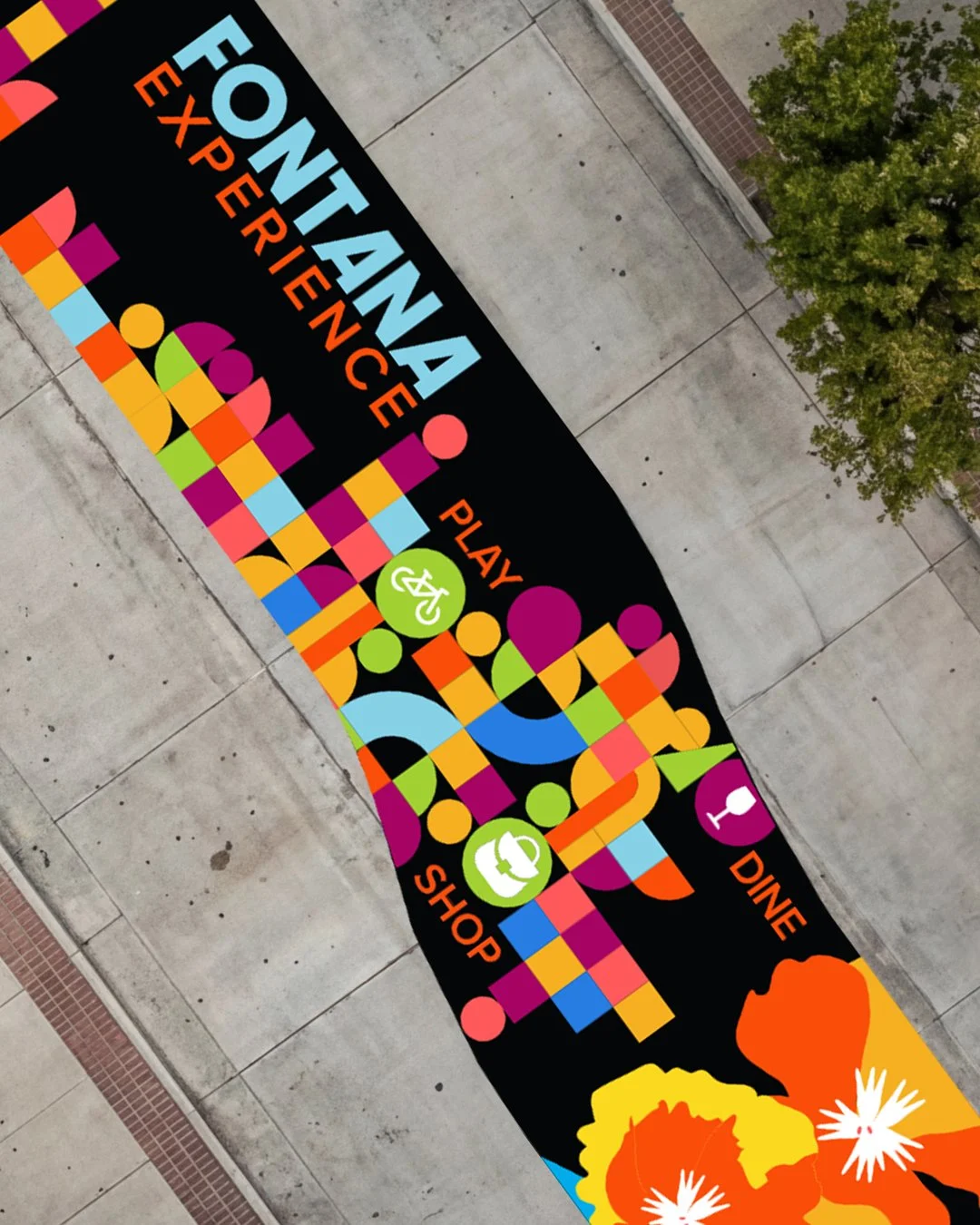
Thinking about going big with a wall or street mural? The impact can't be beat! But creating large scale art can be tricky. Here are 10 things to consider before you start concepting:
Executive Communications
As leaders, it can be hard to know if we are communicating the right things, in the right way, and at the right time.
This quick self-assessment guides you through some self-reflection to see where you’re soaring, and where you may want to shore up your communication.
And here’s the good news: communication mastery can be learned!

Design, Marketing
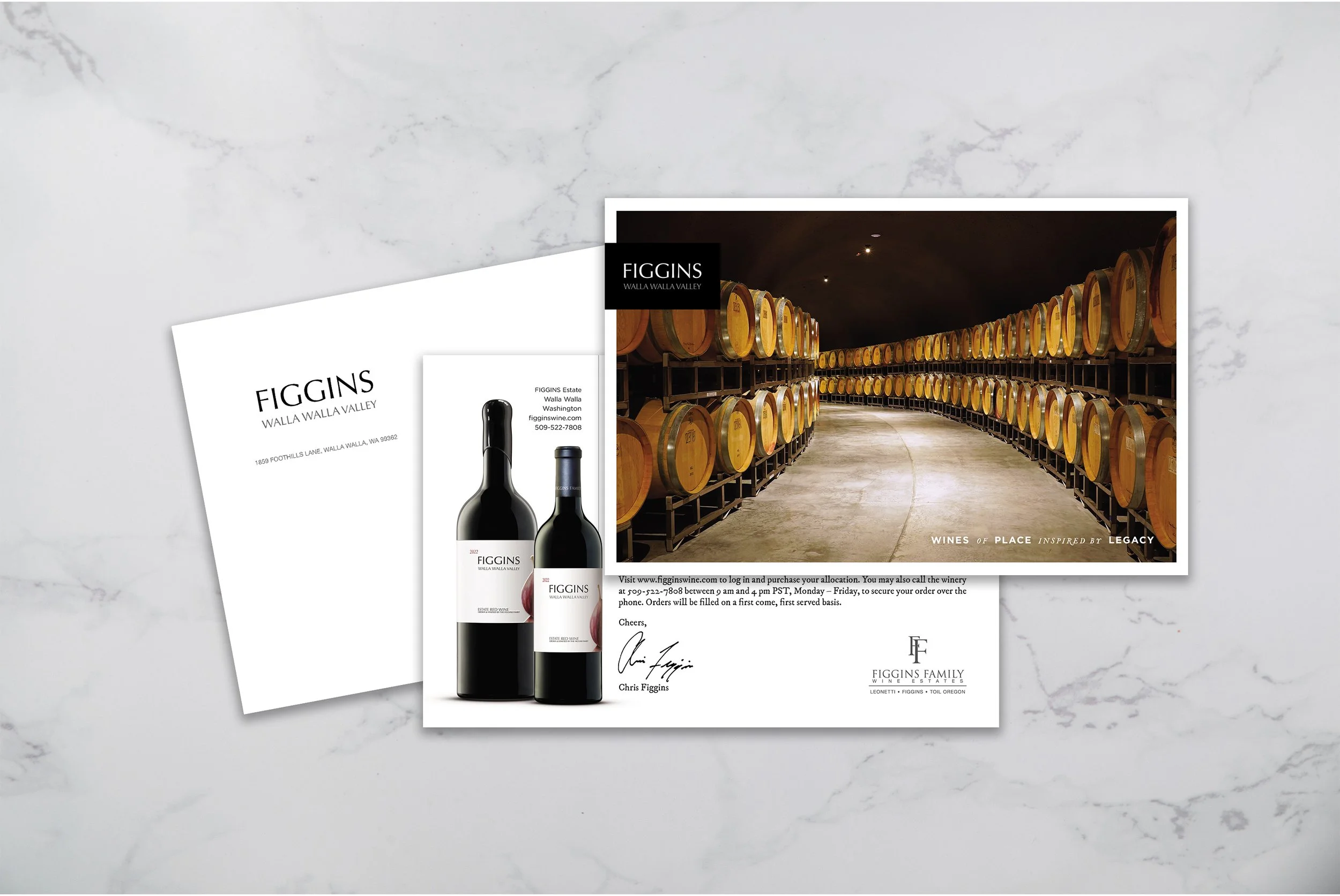
Sometimes the smartest move isn’t another email subject line or boosted post—it’s showing up in someone’s actual mailbox. Direct mail has a kind of presence digital can’t replicated: it interrupts the scroll, cuts through the noise, and lingers on a counter or desk in a way a digital ad never will. When used with intention, it’s less about old-school tactics and more about tactile strategy.
Web, Marketing
An online catalog can either be a brand’s best sales engine—or its fastest way to overwhelm a visitor. The difference is in design and discipline. A great catalog doesn’t just “list products”; it curates them, guides discovery, and makes exploration effortless. If you’re loading dozens (or hundreds) of items, the key is thinking like a shopper, not just a seller as you build your website.
