
The human brain is exposed to more messages in a single day than we can hope to process.
As a result, only the ones we most crave—either because we are interested in the topic or because they are well presented—are the ones we’ll allow into our mind.
The way we adapt to the crowded world of communication is by evaluating a message in a matter of seconds to see if it interests us. If it does not, we move on and conserve our mental energy.
Your job as a presenter, then, is to make it as rewarding and easy as possible for your viewer to grasp your message.
Here are 10 things you can do right now to improve your PowerPoint or other presentations and make your message more likely to get heard, understood, and remembered:
1. More slides are better than fewer.
The brain has to work harder to decipher a lot of content at a single glance, and the harder it has to work, the more likely it is that it will give up. As a presenter, your job is to make it easy to grasp your point.
It’s tempting to think that if you have just a few slides, your presentation will be shorter, but in fact, putting more information on fewer slides reduces the effectiveness of each one and doesn’t change the length at all. You will be covering the same information whether it is all on one slide or on five slides. So make it easy for your viewer to digest one idea at a time by making one important point on each slide.
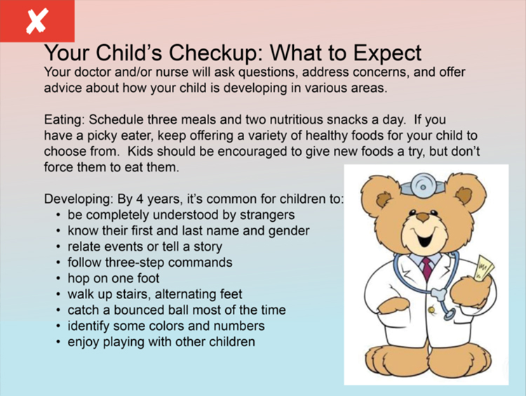
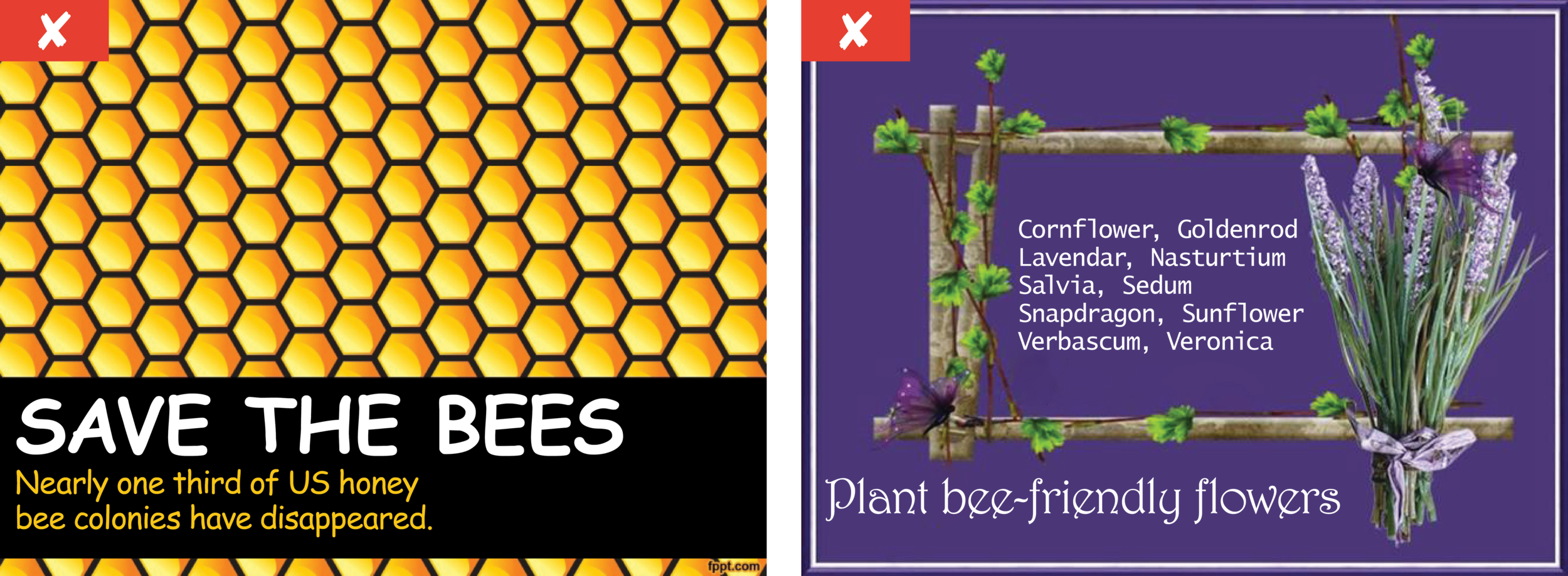
Their Version: Too much info on one slide requires too much mental energy.


Our Version: More slides, with fewer points on each, is easier to understand.

2. Use white space.
White space is the part of your presentation that has neither text nor images on it (and although we refer to it as white space, it can be any solid color). Because the white space gives the eye a vacation from clutter, it’s happily allowed to focus on a single idea presented in images and text. This calms the brain and allows the content to be absorbed with less effort. And the easier it is for a person to get the intended idea, the better the chance they’ll stay with you.
Their Version: Too busy so requires too much mental energy.

Our Version: Simpler, clearer information hierarchy draws the reader in.
3. Create hierarchy through design.
Good design draws the reader through ideas in a logical order—again, making it effortless for the human brain to follow a logical sequence of ideas to the intended destination. Visual dominance demands attention, so the largest, boldest, or brightest elements in your presentation will catch the eye first.
By using a cascading dominance in your visuals, you’ll draw the eye from the most important content to the least, making it easy for the viewer to know where to begin and where to end. When too many elements are equal in dominance, the brain has to work too hard to decide where to go first, next, and last—and often, this is when viewers check out.
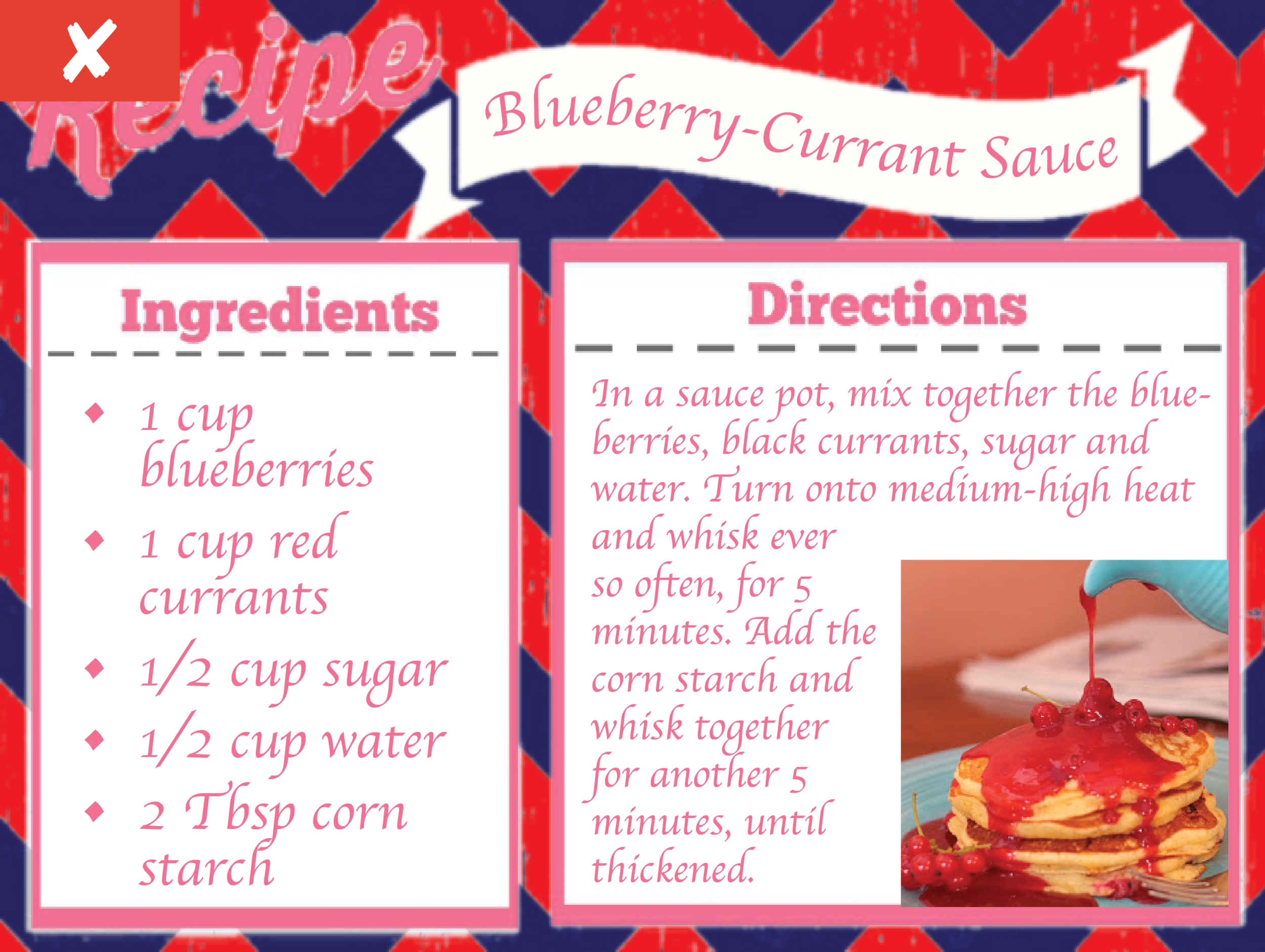
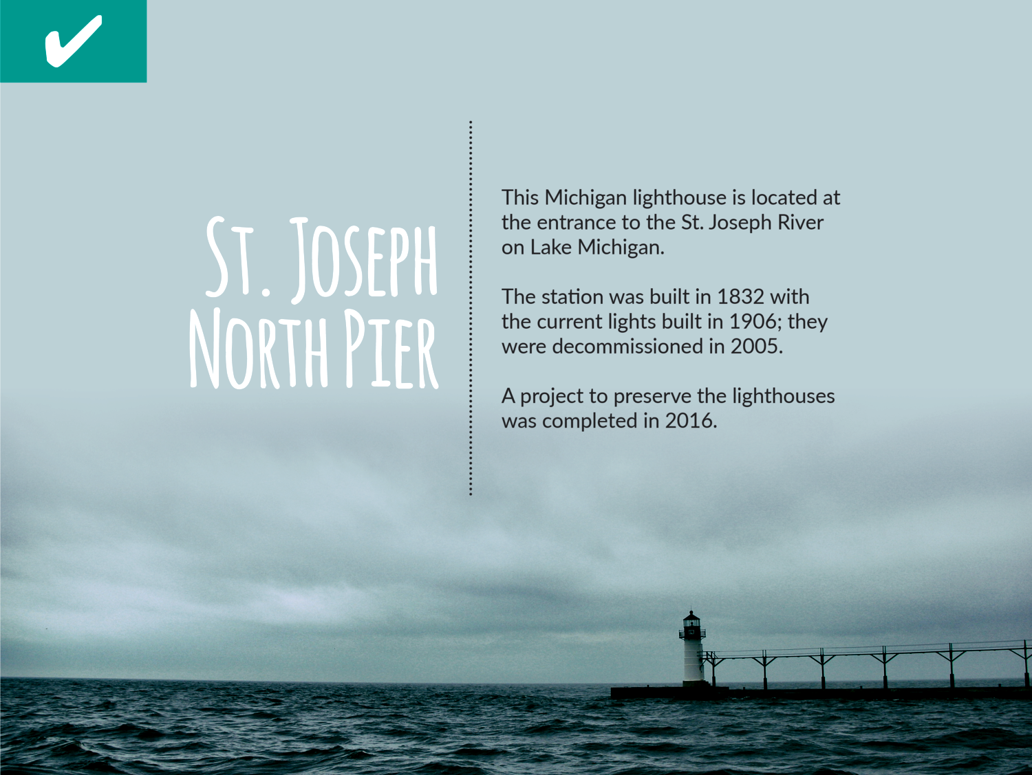
Their Version: All text the same size and in a large block of copy that feels too big to read.
Our Version: Headline allows viewer to immediately decide if the topic interests them, and then move deeper into the smaller text on the right.
4. Keep a consistent visual theme.
Don’t try a different style on every screen, but instead keep common threads that signal “this all belongs together.” This allows the viewers to not have to process as much new information with each screen and helps them focus on the message.
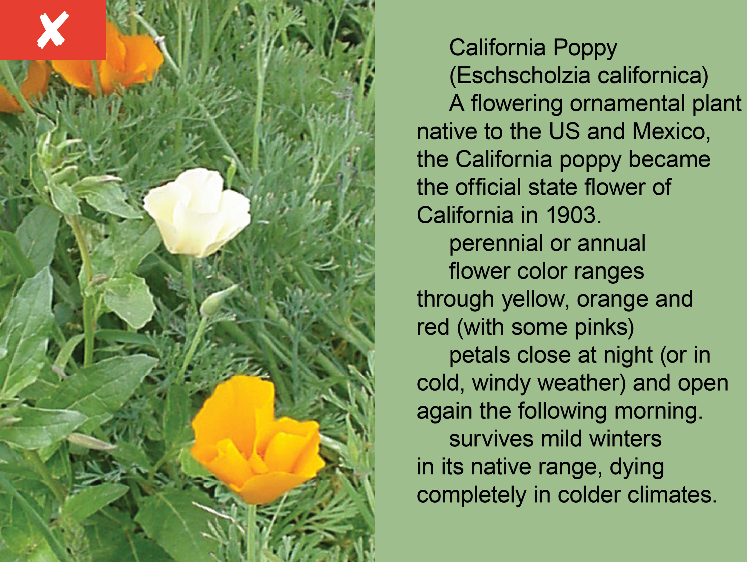
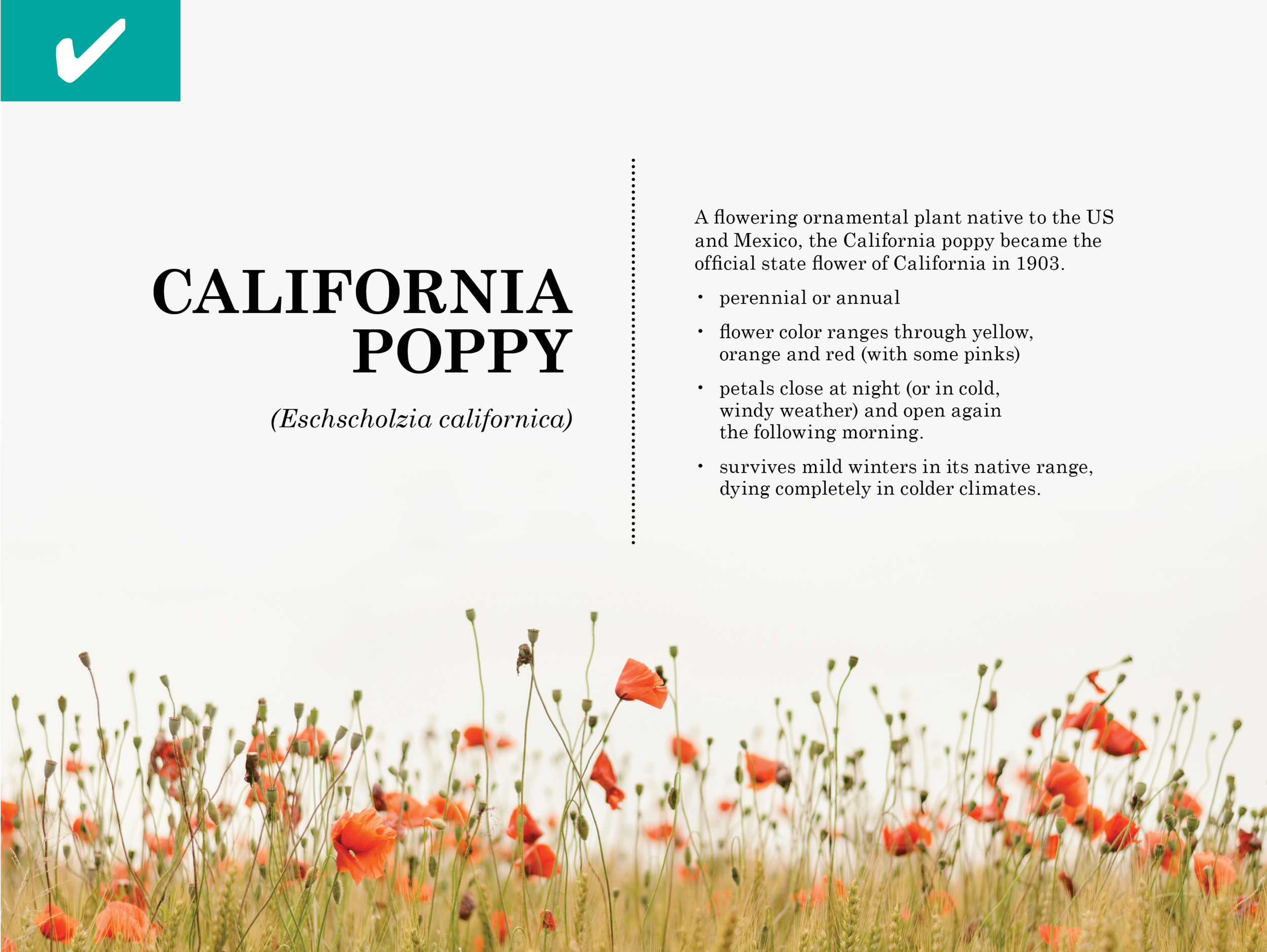
Their Version: No visual clues that the information all belongs together.

Our Version: Now the focus is on the unique content of each slide, as the visuals have instantly telegraphed continuity.
5. Use contrast.
Medium-toned type on a medium-toned background is hard to read. Instead, use high-contrast colors to aid readability. Think combinations like black on tan, white on red, or grey on light blue—rather than orange on red, green on blue, or red on dark blue.

Their Version: Hard to read low-contrast text.
Our Version: Contrast makes message easier to read.
6. Use fonts to provide visual cues.
Keep your font choices to two or three throughout, avoiding overly fussy or hard-to-read fonts. It’s a sure sign of an amateur to use too many or unprofessional fonts—and results in a dizzying experience for the viewer.

Their Version: The brain has to adjust to each change of font, slowing down the reading experience.

Our Version: Using fewer fonts, the eye can now focus just on the message, rather than the font variations.
7. Less is more.
Do you need to put your logo on every screen? Does that illustration make it easier or harder to understand the key point on the screen?
Remove just one item from your slide and see what happens to those that remain.

Their Version: Viewer has to work too hard to find the essential message.

Our Version: Viewer instantly sees the essential message.
8. Use great images.
Today’s viewers have highly sophisticated visual tastes groomed by high-budget Hollywood cinematic productions. Photos that are so-so signal a low-quality product, so spend the time and resources need to use top-quality images.
Photos can also tell a story much more quickly than words, so they are an efficient way to communicate.

Their Version: Low-effort illustration has little visual draw.

Our Version: The scenic view instantly draws in anyone interested in mountains.
9. Use abbreviated language.
On-screen text should only provide emphasis, so there’s no need to have full, complex sentences. Ex: “Delivering a higher quality of health care experience than any other facility in the nation” can be reduced to “The best care anywhere.”

Their Version: Too long.

Our Version: Can't-be-missed brevity.
10. Don’t try to say too much.
It’s tempting to want to show all of the supporting reasons, research, and careful thought behind every idea, to start from the beginning so your viewer will see how you got to your idea. But viewer fatigue is real and will kick in if you ask too much of them.
Aim to leave your audience with one great idea—and see what happens.

Their Version: Too much information to parse quickly.

Our Version: A single, arresting point is received with very little mental energy on the part of the viewer.
It’s harder than ever to get and hold the attention of today’s viewers. In a crowded communication landscape, making your presentation look credible and be compelling is vital. So don’t cheat yourself when it comes to putting your best foot forward in a presentation. It will mean the difference in an audience who stays with you—and one that tunes out.
